
This post will describe a simple way to take health data, as curated in my last blog post, and visualize it using Fusion Tables (a Google Labs product).
A more sophisticated visiualization may be done with Fusion Tables and the Google Maps API, as detailed in the API Developer's Guide, Geo Section, but for this simple example we will create some maps by hand.
We start with the spreadsheet of CHSI data, by loading into Fusion Tables.


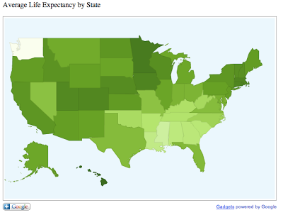
First, we are going to create heat maps of the various health status indicators. For example, average life expectancy, or ALE averaged by state produces a state-by-state map where states with the longer average life expectancy appears darker in color.


The way this works is fairly simple. Fusion Tables simply averages the county data by state and translates the result to a number. It scales the numbers by color, as we see below. In this example there is no data for Washington State so it appears completely white.

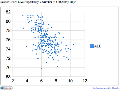
Next, we can create a scatter chart comparing two variables.

In this chart, we compare the average life expectancy on the Y-axis to the annual number of unhealthy days (by air quality) on the X-axis. As one might expect, areas of higher pollution have lower life expectancy.

This is just a quick and simple visualization of open data. Later we will go more in depth and refine our visualizations to extract useful and actionable information.
No comments:
Post a Comment